At OHME!, we believe that packaging is as important as the product itself. Before someone tastes OHME!, they see it on a shelf or in their pantries. That’s why it is so important for the packaging to send the correct message.
Today, we want to pull back the curtains behind our packaging rebrand and dive into the many thoughtful yet often overlooked decisions we made (through many late-night discussions!)

Our Colours: Why We Chose a Rainbow
When we began our rebrand, we didn’t just want packaging that caught your eye. We wanted something that captured the spirit of OHME!.
OHME! was born from the idea of creating a snack that sparks happiness. When thinking about what joy means to us, we remembered how seeing a rainbow always lifted our spirits and signalled a bright day ahead. That feeling became the inspiration behind our bold and colourful brand design today.
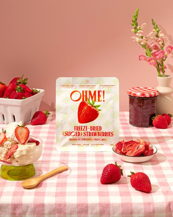
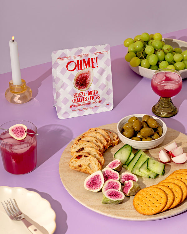
The Pouch: Practical While Cute

When choosing the perfect bag for our snack, we were instantly infatuated with the flat-bottom pouches. Not only were they cute and eye-catching compared to other options, but they also sit beautifully upright on shelves, which gave OHME! a refreshing look when stocked on a store shelf.
Overall, we felt this bag carried a sense of happiness that aligned perfectly with the intent behind OHME!.
The Name: Origin Behind the Name
Believe it or not, “OHME!” is more than just a cute name. Much like our packaging, it originated from a desire to create an experience you would have every time you opened a pouch.
Imagine opening your pantry and seeing your favourite snack, OHME!. It feels like a joyful callout to another great day: “Oh, it’s time to focus on me!”

Emphasis on including “No Added Sugar”
We know that today, people pay much closer attention to what they put into their bodies, even in their snacking decisions. Since so many people today read labels closely, we wanted this to stand out. That’s why our “no added sugar” message is displayed proudly on every OHME! pouch.
Thank You For Your Support!
Every time you choose OHME!, you are choosing a snack made with intention, love, and a whole lot of emotions.
Thank you for being a part of the journey and for letting our rainbow bring you joy!